Crystal MB – Brand Identity Design
Crystal MB is a new printing and branding company in Kenya, created to bring a fresh perspective to design and production. Positioned at the intersection of craftsmanship and innovation, the brand sought an identity that communicates professionalism while setting a bold course for future growth.
I led the naming and brand strategy process, guiding the brand through a series of workshops to clarify its goals, mission, and future outlook. From this work, we defined three guiding principles — clarity, precision, and creative boldness. These became the foundation for the visual direction, which drew inspiration from the sharpness and transparency of a crystal while embracing the uncharted creativity the brand aspired to represent.
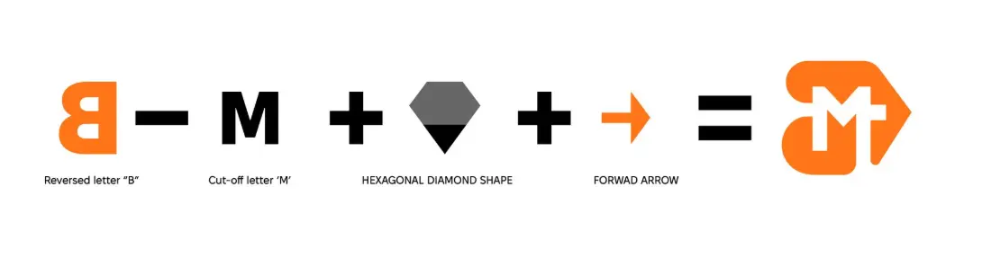
The final identity centers on a custom mark that fuses meaning with simplicity. The design combines a reversed “B” and a cut-off “M,” whose right edge extends into the descending line of a diamond shape. At its sharp point, the form transforms into a forward-moving arrow, symbolizing precision, clarity, and progress.
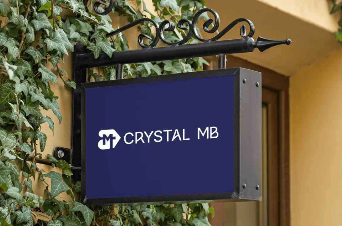
To complement the mark, we crafted a custom wordmark that balances trust with modernity. Following the mark shape and angles, the word Crystal MB appears in a san serif font that customizes the center strokes in the letters 'R', 'A', 'M' and 'B', giving it elegance and authority ensuring a sharp, contemporary finish. Together, these elements sit on one line, reflecting the unity between heritage and innovation.